Ever shrunk a browser window to see how your website looks on mobile, only to find text overflowing or images getting cut off? You’re not alone!
A website that looks great on one device can turn into a frustrating mess on another. And that’s because today we use tons of mobile devices for our everyday needs – smartphones, tablets, and even smartwatches can display or look for information online.
This is where responsive web design comes in. In this blog, we’ll explore the concept of responsive web design and offer you some exciting tips and tricks for staying ahead of the competition.
- What Is Responsive Web Design?
- How Does Responsive Web Design Work? A Quick Tutorial
- Responsive Web Design Benefits for Beginners
- Understanding Responsive Design Jargon (For Beginners)
- Responsive Web Design Examples in Action
- The Future of Responsive Web Design
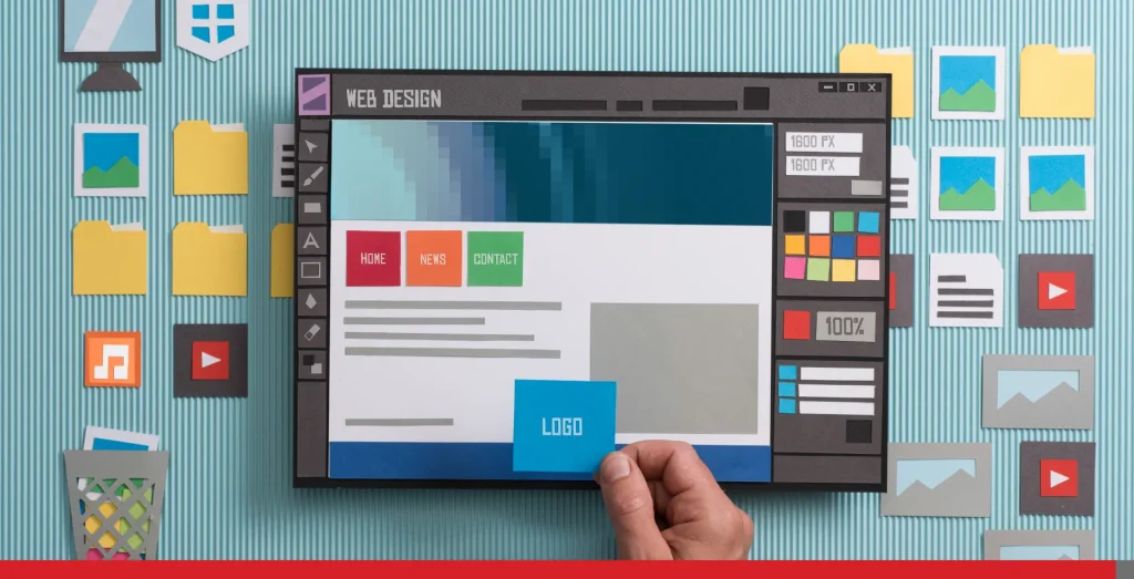
What Is Responsive Web Design?
Web designers use responsive web design to ensure a website automatically adjusts its layout and elements to fit any screen size.
Imagine a website that can transform itself, like a chameleon, to provide an optimal viewing experience on any device, from a wide desktop monitor to a tiny phone screen. That’s the magic of responsive design.
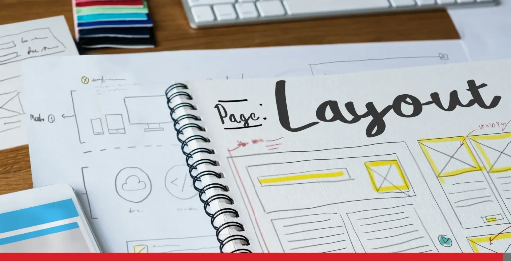
How Does Responsive Web Design Work? A Quick Tutorial
The easiest way to control a website’s design, like the maximum browser width or the size of the layout elements, or the multiple columns, is through HTML and CSS styles.
While coding a fully responsive website can involve advanced techniques, here’s a breakdown of the foundational concepts to get you started.
Understanding Screen Sizes
The first step is to consider the different screen sizes users might encounter. Here’s a glimpse into the most common ones:
- Desktops: Typically range from 1280px to 1920px wide.
- Laptops: Can vary between 1366px and 1920px wide.
- Tablets: Usually fall in the 768px to 1536px wide range.
- Smartphones: Often have screens between 320px and 1080px wide.
Setting Up a Test Environment
To visualize how your website responds to different screen sizes, you can use developer tools built into most web browsers. Here’s how to set the screen width for testing purposes:
- Open your website in a web browser (Chrome, Firefox, etc.).
- Navigate to your website or any website.
- Right-click anywhere on the webpage and select “Inspect” or “Inspect Element” (depending on the browser). You can also hit F12 for faster access!
- This opens the developer tools window. Locate the “Device toolbar” section (it might be hidden under a menu like “More tools” or under three vertical dots).
- Click on the “Device toolbar” icon and select a pre-set device size (e.g., tablet, mobile) or enter a specific width in the viewport width field.
Now, your web browser window shrinks to mimic the chosen screen size, allowing you to see how your website layout behaves.
Introducing CSS Media Queries
This is where the magic happens! CSS media queries are essentially lines of code instructing your website to adjust its styles (like layout, font size, and image size) based on specific screen size conditions.
With the test environment we showed earlier, you have the ability to modify the appearance and user experience of any website in real-time, albeit only within your viewport.
Here’s a basic example of a media query:
/* This code applies CSS styles only when the screen width is less than 768px (for example tablet/mobile device) */

@media only screen and (max-width: 768px) {

  /* Your responsive styles for smaller screens go here */

  .content {

    font-size: 16px; /* Reduce font size for better readability on smaller screens */

  }

  .image {

    width: 100%; /* Make images responsive by setting width to 100% of the viewport */

  }

}
This code is just an example. You should edit your code to fit your own project.
In essence, media queries allow you to create different versions of your website layout for various screen sizes. By combining these concepts with a flexible website structure and responsive design principles, you can ensure your website offers an optimal viewing experience for everyone, no matter what device they use.
Remember, this is just a starting point! As you delve deeper into responsive web design, you’ll discover more advanced techniques to create truly dynamic and user-friendly websites.

Responsive Web Design Benefits for Beginners
Think about the last time you browsed the web on your phone.
Did you encounter a website with tiny text you could barely read, buttons that were impossible to click with your thumb or images that stretched out of proportion? Such experiences can be exceedingly frustrating.
Responsive web design solves all these problems and ensures your website offers a smooth and enjoyable experience for visitors, no matter what device they use.
Here’s how responsive design benefits your website and your visitors:
- Seamless user experience (UX) for all: Responsive design ensures your website looks great and functions flawlessly on any screen size, from a desktop computer to a tiny phone. Users can easily navigate your web pages, view clear visuals, and read content comfortably from different devices. This happy user experience keeps them engaged and coming back for more!
- Mobile-friendly navigation: No more struggling with tiny buttons or menus that disappear on a mobile screen. A flexible layout adapts your website to make navigation easy and intuitive on touchscreens. Users can find what they’re looking for quickly and efficiently, leading to a more positive experience.
- Clear visuals and readability: Images that resize proportionally and text that automatically adjusts to fit the screen. No more blurry pictures or squinting to read tiny text on a small phone. With responsive images, your website will always look sharp and be easy to read, no matter the device.
- SEO boost from Google: Did you know that Google prioritizes mobile-friendly websites in search rankings? Since most people search the web on their phones, it makes sense! A responsive website is more likely to rank higher in search results, leading to increased organic traffic and potential customers.
- Cost-effective solution: Maintaining separate mobile and desktop websites can be expensive and time-consuming. But with a responsive design, you only need to manage one website that automatically adapts to all devices. This saves you money and resources in the long run.
When resources and server performance are at stake, consider speaking to an EasyHosting representative. You’ll be amazed by how affordable your website can be.
Email us at support@easyhosting.com or call us at 1-888-390-1210 to find out more.

Understanding Responsive Design Jargon (For Beginners)
While responsive web design offers a fantastic solution for websites that look great on any device, it can come with some new terms you might not be familiar with.
But, we’re here to break down some commonly used lingo, explained in a way that’s easy to understand:
- Viewport: Imagine the viewing area of your web browser window on a computer or the entire screen of your mobile phone. That’s the viewport! It’s essentially the real estate where your website content is displayed. Responsive design ensures your website adjusts its layout to fit within this viewport, no matter the device size.
- CSS media queries: Think of these as the magic instructions that tell your website how to adapt based on different screen sizes. Media queries are written in code and basically say things like, “if the viewport width is less than 768 pixels (typical size of a phone screen), then switch to a single-column layout.” This ensures your website elements like menus and content rearrange themselves for optimal viewing on any device.
- Fluid grids or flexible grid: Gone are the days of rigid website layouts! Responsive design uses flexible grids, like a web of rows and columns, that can expand and contract depending on the screen size. This allows your content to stay organized and visually appealing, no matter how big or small the viewport is.
- Responsive images: Large images can wreak havoc on a mobile screen. Responsive design uses flexible images (images on multiple resolutions) and techniques that ensure pictures resize proportionally to fit the viewport. This prevents blurry or distorted images and keeps your website looking sharp on all devices.
These are just a few key terms for a responsive site.
Responsive Web Design Examples in Action
The beauty of responsive web design lies in its ability to create a seamless user experience (UX) across all devices, from desktops to smartphones. Let’s look at some inspiring responsive web design examples spanning different industries.
1. Portfolio Website (Creative Industry)
Imagine a photographer’s website showcasing stunning, high-resolution images. On a desktop computer, these images might be displayed in a grid layout with detailed captions.
However, the same website with a responsive web design would ensure those beautiful photos resize beautifully on a mobile phone screen.
The layout might switch to a single-column format with clear buttons for easy navigation. This ensures mobile users can still appreciate the visual content without any frustration.
2. eCommerce Store (Retail Industry)
Think about your favourite online clothing store. With responsive web design, the website flawlessly adapts to any screen size. On a desktop, users might see a multi-column layout with detailed product descriptions and options for sorting and filtering.
However, on a mobile phone, the responsive web design website might display products in a single column with clear “Buy Now” buttons underneath them. The checkout process would also be optimized for touchscreens, allowing for a smooth and efficient shopping experience on mobile devices with big buttons to prevent mistaps.
3. Restaurant Website (Hospitality Industry)
A restaurant website with responsive web design ensures both desktop and mobile users can easily access crucial information. On a desktop, the website might showcase a high-resolution image of the restaurant’s ambiance and a detailed menu with descriptions.
However, the responsive web design version for mobile phones might prioritize displaying contact information, reservation options, and a simplified menu with clear visuals. This allows potential smartphone customers to quickly find what they’re looking for and make a reservation or order takeout.
These are just a few examples, but they highlight the power of responsive web design in our everyday lives. By adapting to different screen sizes and user behaviours, responsive websites provide optimal usability for everyone, regardless of the device they choose.
This translates into a positive user experience and increased engagement, and ultimately, helps businesses achieve their goals.
The Future of Responsive Web Design
The world of responsive web design is constantly evolving to keep pace with new technologies and user behaviours. Here are a few exciting trends to watch:
- Voice search optimization: As voice assistants like Siri and Alexa become more popular, websites will need to be optimized for voice search. Responsive design will play a role in ensuring content is structured and accessible for voice queries, regardless of the device used. Plus, we’ve written about this interesting topic of voice search optimization in the past.
- Foldable phone compatibility: With the rise of foldable phones that boast unique screen dimensions, responsive web design will need to adapt further. The future lies in creating websites that can adjust seamlessly to these innovative devices, and while this means more CSS code in the backend, it can ensure your messaging gets across to your audience.
- Enhanced user experience (UX) personalization: This kind of responsive web design will likely integrate with user behaviour data to personalize the experience on different devices. Imagine a website that automatically adjusts the layout based on your browsing history or preferences, no matter what device you’re using.
Conclusion
A responsive web page ensures your website delivers a seamless and positive user experience for everyone, regardless of the device they choose to access your web pages. There are tons of responsive web designs available both for free and for paid themes.
WordPress is widely recognized as one of the leading CMS platforms globally. With comprehensive support for modern responsive design elements, it’s suitable for a wide range of website types, including personal and corporate sites.
This translates into increased engagement, higher conversion rates, and, ultimately, success for your online presence.
Here at EasyHosting, we understand the importance of responsive web design, and we offer a variety of solutions to cater to your needs:
- Easy-to-use website builders with built-in responsive themes allow you to create a mobile-friendly website yourself.
- Our professional web design services, provided by our team of experienced designers, ensure a unique and responsive website that reflects your brand perfectly, often at a fraction of the cost of a web design agency.
Get a website tailored for you! Ensure your website is responsive and take advantage of its many benefits. We can help you get started.
Contact us at support@easyhosting.com or call us at 1-888-390-1210 to find out more.